The High Converting Landing Page: 13 Must-Have Elements
A landing page is designed to sell a product or service or to capture someone’s contact information. Basically, its meant to maximize conversions. A product, service, or even a homepage all fall under one category: the landing page. Also, how you layout your Squarespace website design will directly impact if people buy your stuff or not.
Luckily, I have a tutorial that you can use when creating a Squarespace landing page that will ensure that you have all the needed sections to turn browsers into customers, and I’m going to walk you through them step-by-step.
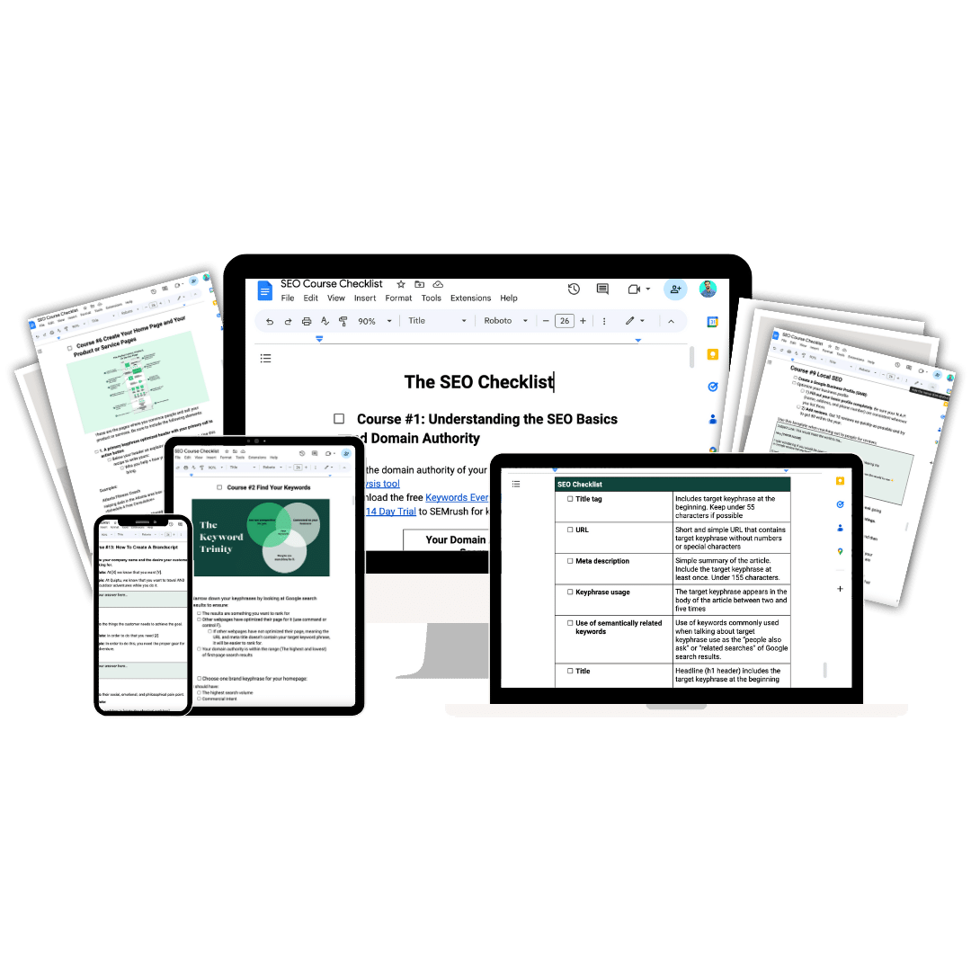
To make it even easier you can download my free and fillable SEO checklist that breaks down these sections and more.
1. The Hero Section
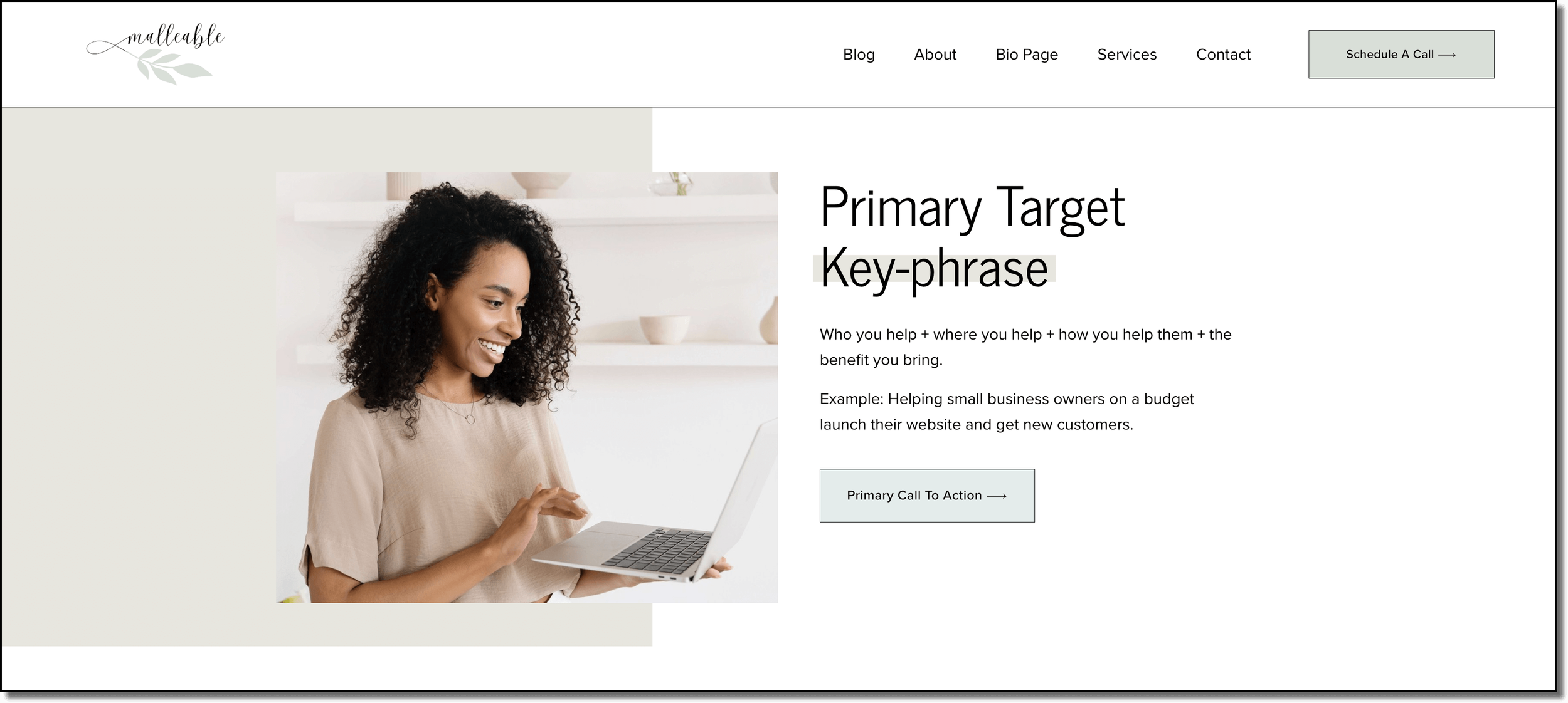
Every landing page has a hero section. This is the first thing that someone sees when they land on the page. It should explain what you do and how you help in a simple and clear way. Every Hero section is made up of three parts:
An SEO-Optimized Header
Here is a rule: If you are unsure which keyword(s) a page is targeting, then you will never rank for that phrase in search engines like Google. Your Hero heading should be a heading one or H1, and it is the only h1 you will have on the whole page. It needs to be:
One to five words long
Connected with your product or service
Have search traffic
Something you can actually rank for
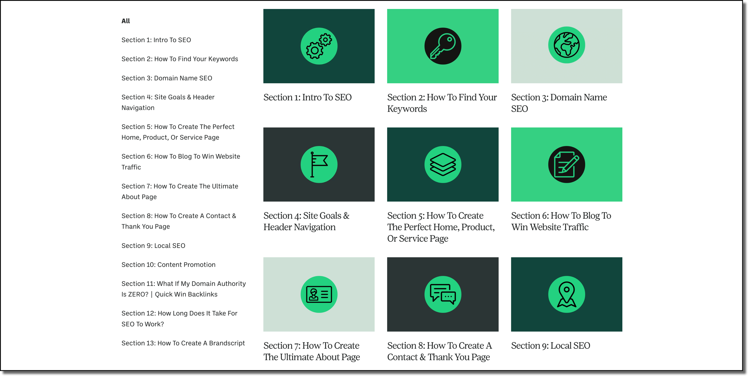
If you are new to SEO you can find my tutorial overview here:
If you want to find your businesses specific keywords you can find that tutorial here:
Your Product Or Service Hero Description
This needs to be simple and clear above all else. Here is the formula for writing the perfect hero description:
Who you help + Where you help them (if you are a local business) + how you help them + and the benefit you bring.
For example:
Helping dads in the Atlanta area lose weight to feel like themselves again
Helping software businesses build their social media presence to grow revenue
A Call To Action
Your call to action (CTA) needs to let the visitor know exactly what you want them to do next. Don’t say “learn more.” Say “schedule a 15-minute demo.”
It should also have a bright picture of either your product or a human looking at your hero CTA.
Email marketing and landing pages
Sometimes the goal of a landing page is to build an email list of people who are interested in your stuff. This can be helpful if you have a higher ticket item that someone usually won’t buy right away. You need a way to stay in contact with them throughout their decision-making process.
For this, you will need a lead magnet or freebie. This could be a downloadable pdf, a video course, a Canva template, a webinar, or anything else that will really help someone in their journey, and is related to your product or service.
For example, for my website I give a free and fillable SEO checklist and put it in the footer. It looks like this.
At the bare minimum, you’ll need a picture of your freebie and an email sign-up form that captures their name and email address.
These types of landing pages are called cover pages and they usually provide minimal information with a clear call to action. Squarespace has a built-in email provider, but I have found it easier to use Mailchimp. It’s free, it easily integrates with Squarespace, and it makes it super easy to design cute email campaigns.
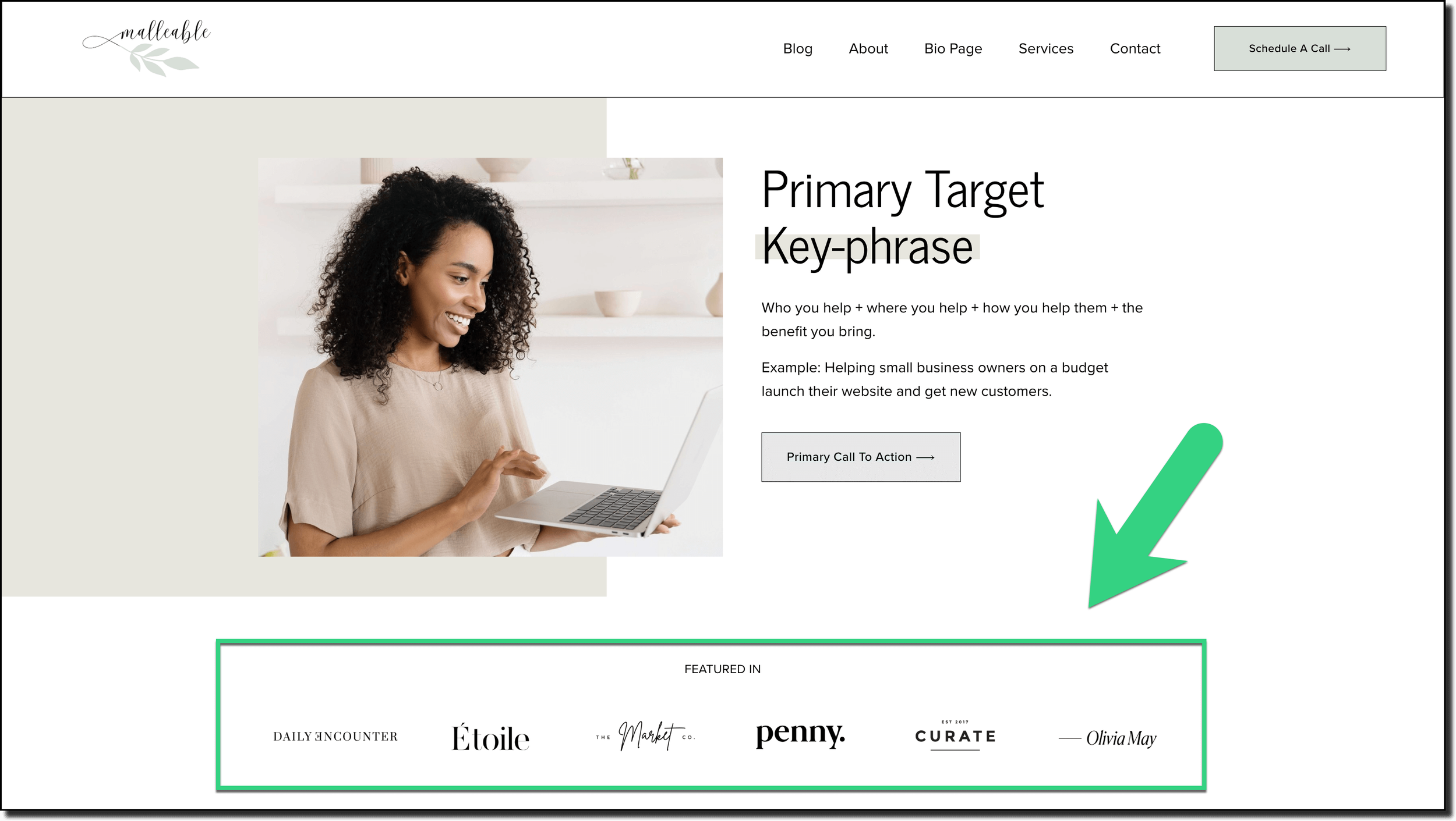
2. Use Quick Visual Credibility
Logos work best here. Show brands you have worked with, pictures of completed projects, or quotes from happy customers.
3. The Brand Video
A video allows you to connect with customers on a human level, explain your process, or display a testimonial from a customer. I like to use a brandscript for this video because it helps to explain your business in a clear and simple way.
Here is an example of one of my brandscript videos.
4. Keyword Optimized Sub-Headers
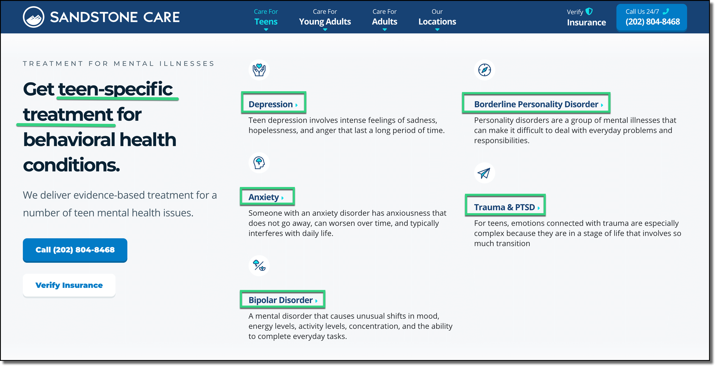
Your landing page needs meaningful keyword-optimized subheaders also known as H2s or Heading Twos connected with your product or service.
H2s help to tell search engines what your content is about.
A mental health clinic should talk about depression, trauma, and anxiety because those are search-optimized categories that people care about and are looking for when it comes to mental health treatment.
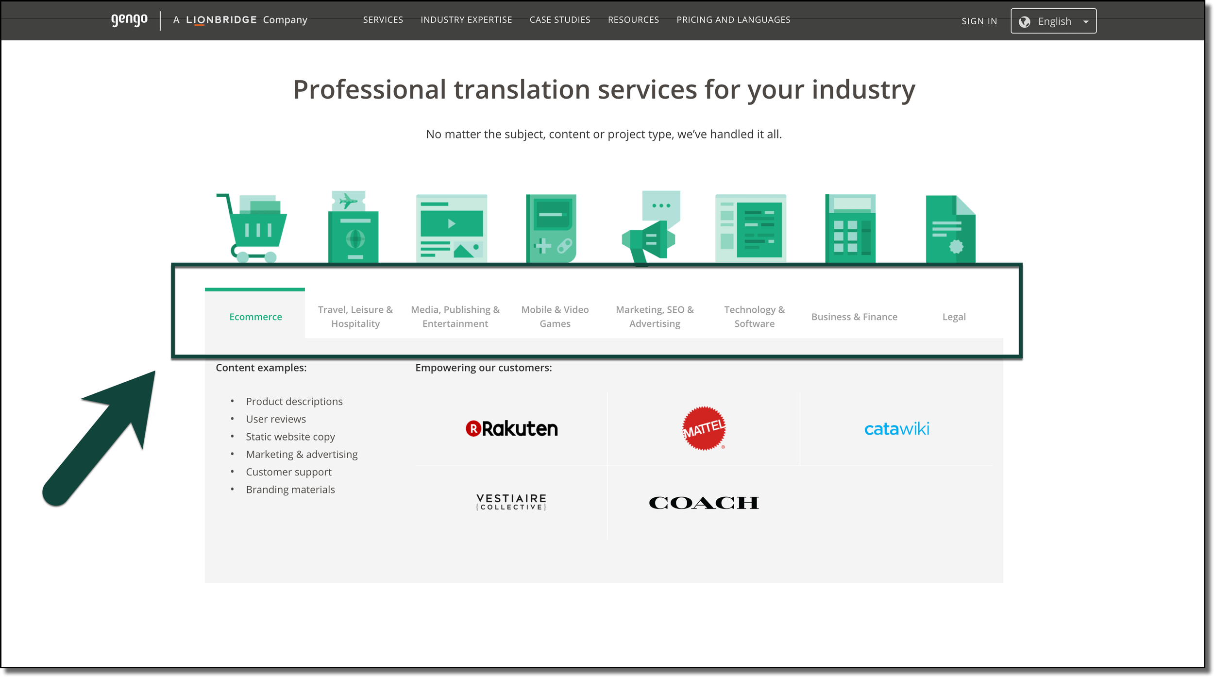
A Language translation service should list the types of content they translate for the same reason.
The easiest way to find the keyword phrases you should include in your subheaders is by using a content writing tool like Clearscope.
All you have to do is type in your target keyword phrase and then it will create a report. On the right are connected keywords that you should also use on this webpage.
You can even sort them by importance and heading as you are building out your content. Then as you type your content it will check off that keyword from your list and increase the letter grade in the top left. The higher the grade the more keyword rich your text is.
A free way to find subheaders is to look at the bottom of search results on Google in the “related searches” section. For example for “Atlanta therapy” we can see that there are some meaningful categories that might be worth highlighting if they are relevant to your business.
Just be sure to use your keywords in ways that are actually helpful and that make sense to the person on the webpage, not just for Google.
5. Answers To Top Questions
All landing pages need Answers to top questions your customers might have. Just like credibility in the form of quotes, examples, videos, and logos, you don’t want to put all of your FAQs on just one page, you want to address to questions they have at the moment too.
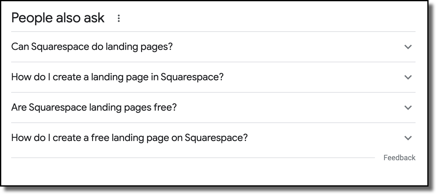
The easiest way to find these questions is to use the “people also ask” feature on Google. Type in your keyphrase and look at the common connected questions that people have related to that question. As you click the drop-down arrow for questions, even more questions will populate at the bottom.
If possible, and if it is related to your business, copy the questions in the exact wording and paste it to your webpage as an H2, then answer that on your as simply and as clearly as possible.
Orbit Media, a Chicago web design company does a good job with this with their section titled “What if I am not 100% sure of what I want.” They follow up by saying “That is understandable” This shows they are anticipating potential customers' problems and that they have empathy.
6. The Problem Section
The best landing pages have A problem section. Think about the physical, emotional, and philosophical problems that your customers have.
Physical problems usually have to do with time, money, and energy
You don’t have the time to interview job applicants with your busy schedule.
Your budget doesn’t allow you to waste money on advertising that doesn’t get you customers.
You don’t have the energy to ideate, shoot, edit, and post all your content each week.
Emotional problems are how you feel about the physical problem. Are you anxious, frustrated, or overwhelmed?
You feel frustrated that you can’t keep up with your job responsibilities.
You are anxious that your customers are passing you up.
You are overwhelmed by the workload and know you can’t keep it up.
Philosophical problems are what the customer feels should or should not be the case about the problem.
You believe there SHOULD be a way to interview applicants on your schedule.
You believe you SHOULDN’T have to pay if you are not seeing results.
You believe there SHOULD be a way to make content consistently without burning out.
Your solution is always more valuable when it’s compared to the problem that you solve, so do this earlier on the page.
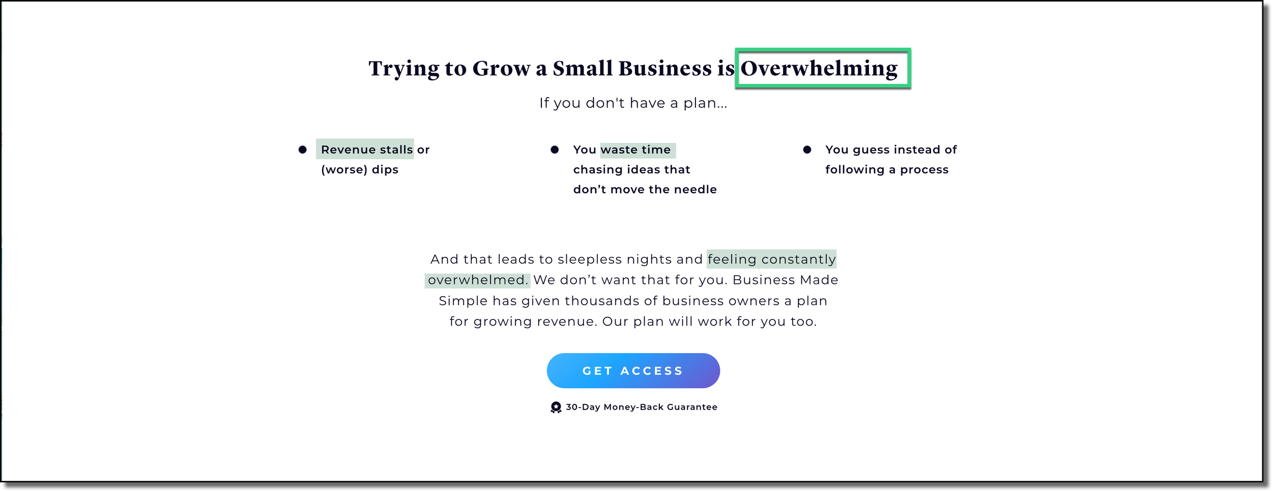
Here is a really good example from a Business Made Simple:
They hit the physical problem by talking about a dip in revenue and wasting time. Then, later they talk about feeling constantly overwhelmed.
7. The Steps Section
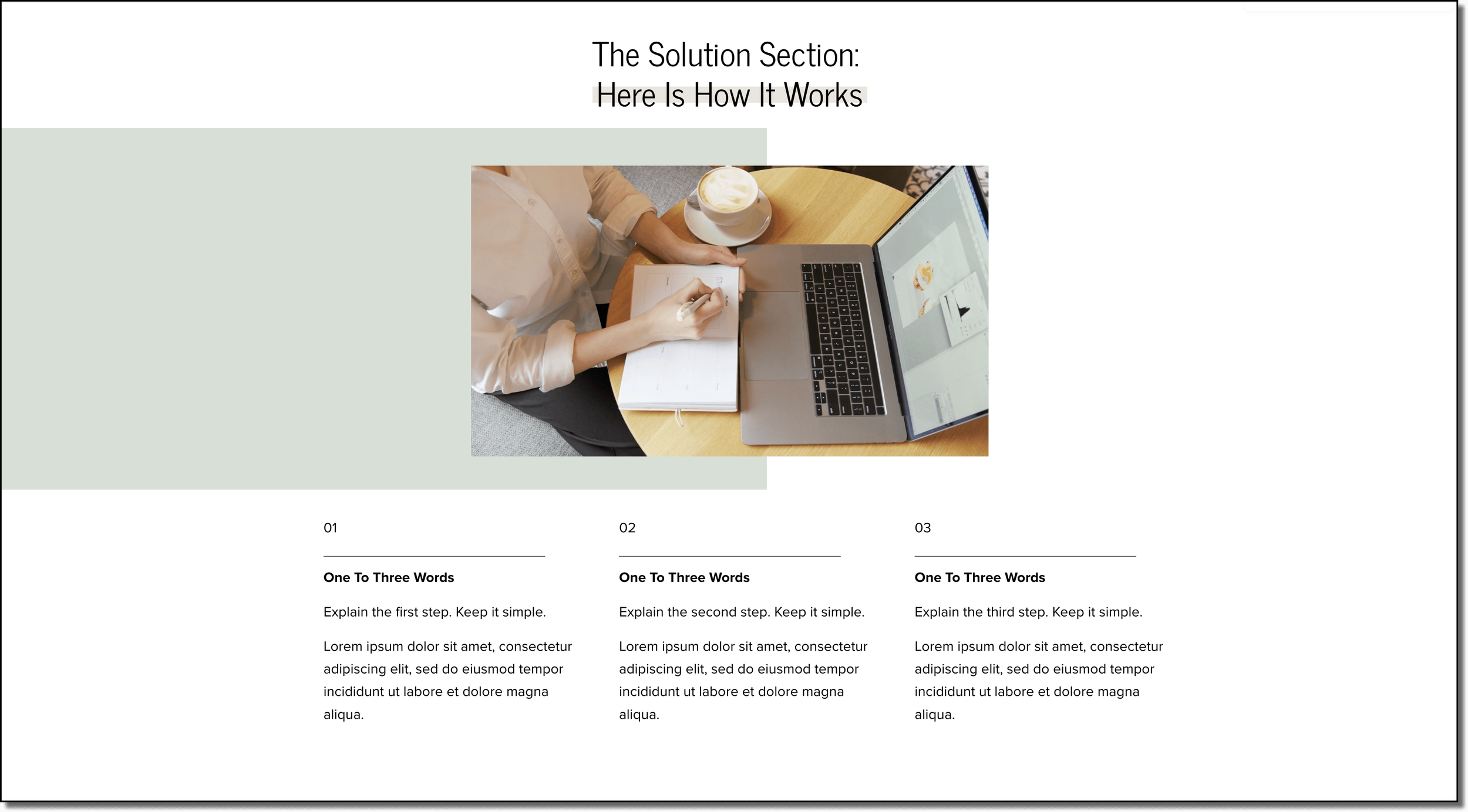
The steps section shows how to work with you in three steps or less. The reason it is three is that studies show that after three we remember less and less of a process or list. Plus, the goal of this section is to make it seem super simple to work with you.
Even if your internal process is way more complicated, you need to zoom way out to make it seem easy. For example, you could say.
Step 1- schedule a free consultation
Step 2- We’ll get to know you and your goals.
Step 3- We’ll give you a simple and clear plan of action with transparent pricing.
I like this transcription service website. They lay it out clearly, upload, pay, and get a transcript. This makes it seem super simple to work with them.
8. Testimonials & Social Proof
I’m putting this here twice because it is that important. Basically, anytime you want your visitor to make a decision (as in click a button to call or schedule a meeting) you want to pair it with some social proof.
You should not have one review page on your Squarespace website. Every product or service page on your website should be a review page.
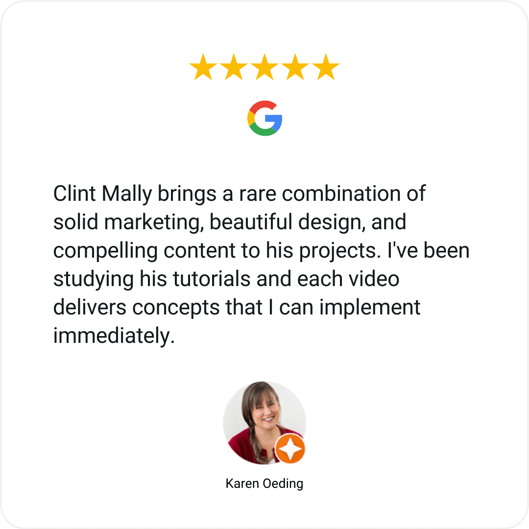
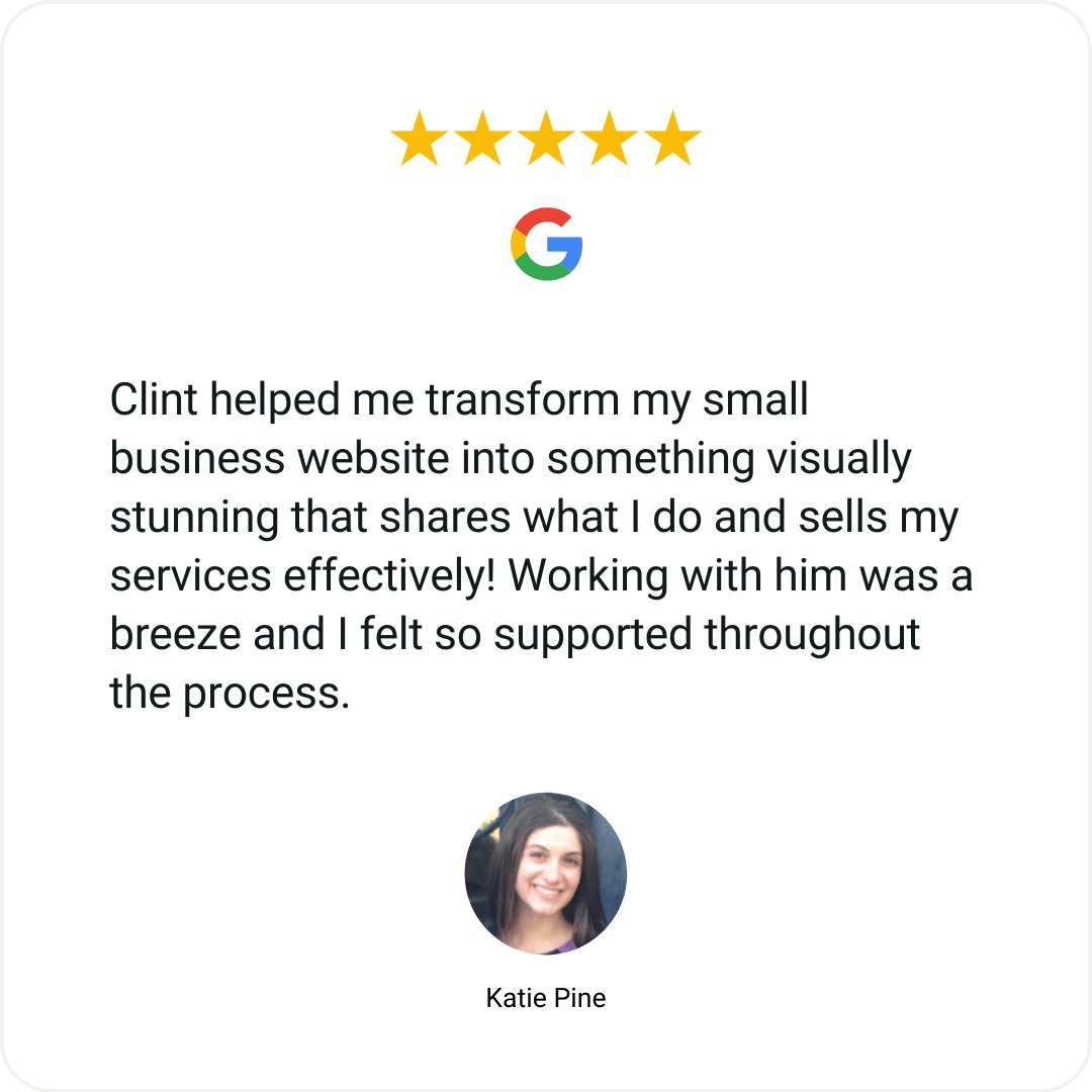
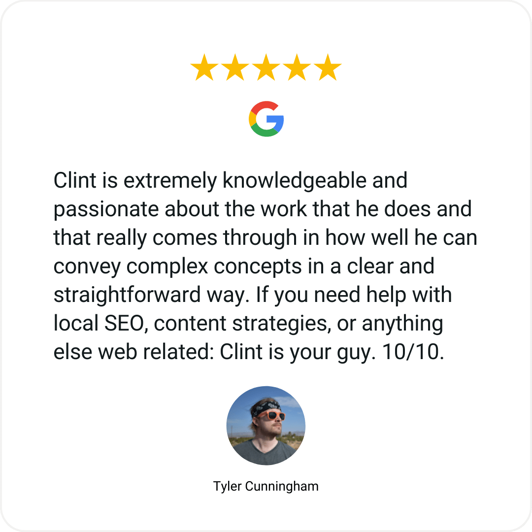
This could be embedding your Google reviews:
A custom quote:
“Clint is an absolute pro. His approach to content checks all the boxes: super practical, focused on relationships, in a mix of formats, and its all strategically aligned.
Clint is doing great things. This is someone to watch. Follow him. See how he’s doing things. Then emulate his approach ...or just hire him if you need the help.
If nothing else, just remember his name. You’ll be seeing it again for sure.”
Or probably the best testimonial (a short and sweet video testimonial).
9. Truly Helpful Visuals
Stock art doesn’t convey who you are or your brand. It is generic. Instead include:
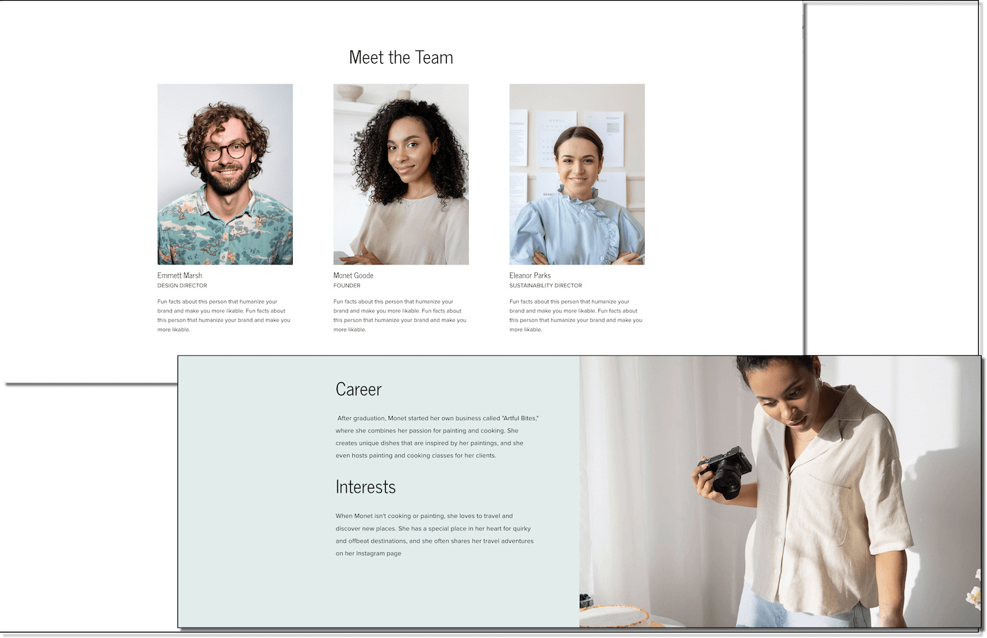
Pictures of you, your team, or your location. This stuff reminds folks that you are real people doing real stuff.
Pictures or examples of work you have done. It doesn’t matter if you have physical products or digital products, you need to show examples of your work or your business in action fulfilling a service throughout this page.
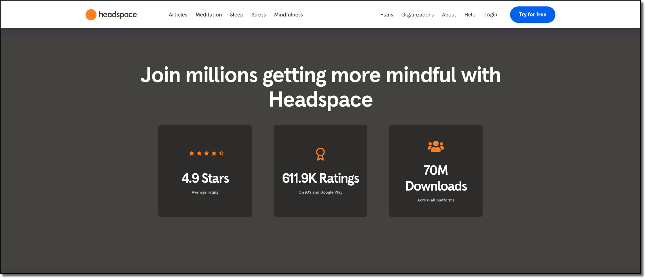
Use Data & Statistics
Showing is always better than telling on a website. If you can quantify your results with a chart, graph, or diagram then you need to do that.
This appeals to the logos side of our reasoning, meaning we like to feel like our decisions are based on logic and facts and not just our emotions, and numbers help us do that.
Headspace does this by showing off its ratings and downloads.
Branded Icons
These are helpful, especially if you work in tech or software where it is hard to take pictures of your work. Just make sure it fits your brand colors.
There are tons of websites where you can update the color of images to match your brand. Undraw, humaaans, flaticon, and iconscout are just a few.
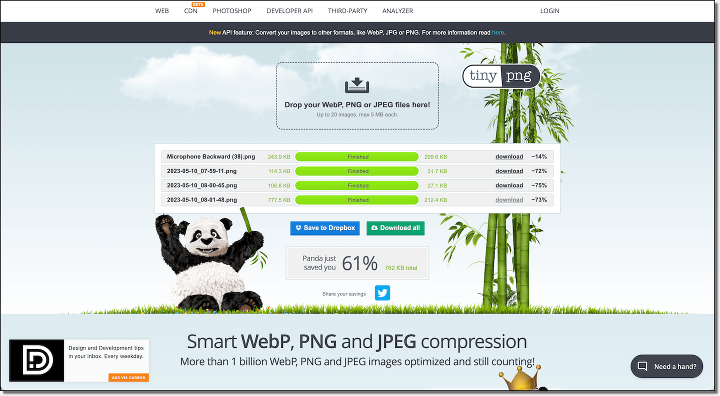
A Quick note about images. Large image files are the number one reason why Squarespace sites load slowly. Make sure each image you upload is under 250 Kilobytes.
A simple way to compress an image is to use the free tool tinypng.com. Here you can upload a jpeg or png it will compress it, and show you how big it was, and how big it is now.
10. A Final Call To Action
This could be your primary call to action (CTA) like call, schedule, or buy, or a secondary call to action like a lead magnet or newsletter sign-up.
I like to include my secondary call to action in the footer to make sure it’s included on every page. If someone gets to the bottom of any of your web pages it means they actually appreciate your content, so why not.
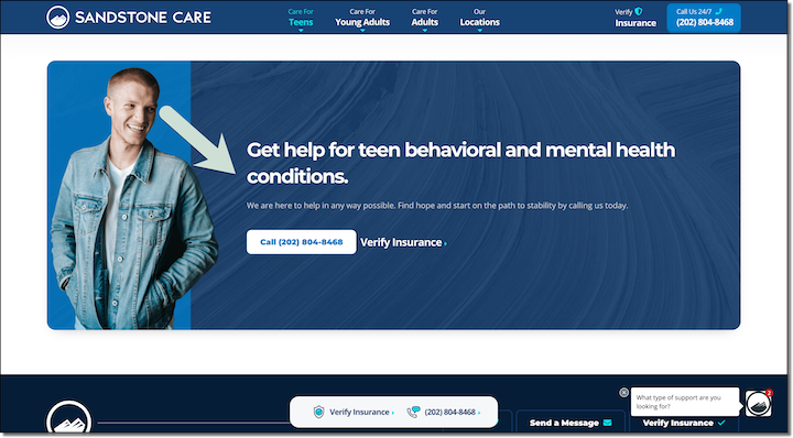
For heroes and calls to action, it’s best to have a picture of a person looking at or pointing to the opt-in or to have a physical representation of your thing. Here is an excellent example from Sandstone Care, where they have a dude looking right where they want you to click.
11. Use A Chat Bot
You may not have a support team to man the chat line 24/7 but that doesn’t mean you can use these. You can program support options, use AI, or a personal favorite of mine is using video chatbots to combine the two like this one from Video Ask.
Basically, you map out the journey someone might take in their decision process and film short videos to walk them through stuff.
Chatbots are great because they are sticky, meaning they say with the browser as they scroll and they can help lead the visitor in the right direction.
12. Use A Pre-Built Squarespace Template
Staring at a blank page can be intimidating. Having to choose fonts, decide on background colors, or insert code injections to make your landing page look awesome can take a ton of time even with an awesome landing page builder like Squarespace.
That is why I created the completely customizable Squarespace template called Malleable in Squarespace 7.1. It includes everything I have talked about in this article and way way more.
Plus, it comes with a library of tutorial videos that make it super easy to change your landing page settings to make it completely on-brand.
13. How To Remove The Header or Footer From Your Squarespace Site
Option anxiety is a real thing. Sometimes, when someone has more things that they can click on for a landing page, they end up getting distracted on your about page and not taking the action you are looking for.
Removing the header and/or footer can help focus the browser to take the specific action you are looking for. Here is how to do it.
1. To begin, log in to your Squarespace account and navigate to the desired page to obtain its unique ID.
2. To discover the page ID, it is necessary to install a Chrome extension known as Squarespace ID Finder. Following the installation, you can employ the acquired ID in the code provided below:
Copy This Code
Page-ID { footer, header { display: none !important; } }
3. To remove the header from a specific page in Squarespace, proceed by copying the aforementioned code, and substituting "Page-ID" with the ID of your own page. Then, access Design > Custom CSS and paste the code into the designated area.
4. If you only want to remove the header, then delete the word “footer.” The same is true if you only want to remove the footer, delete the word “header” from the code.
5. Finally, click save. Upon doing so, both the header and footer will be successfully eliminated from the designated page.
Continue Reading

